
Gus
Paludeti
Paludeti
User Research | Product Designer | UI/UX Designer
March 2023 - April 2023 (2 weeks)
I helped Starbucks' Improve the mobile ordering wait experience for customers who are waiting for their orders to be made.
I sought to improve the user experience for customers who are waiting for their orders to be made. Currently, customers may have to wait in line or at their table without knowing how long their wait will be. But with this new project, I aim to create a system that will make the wait time feel shorter and more enjoyable.
To initiate my discovery process, I conducted Zoom interviews with four participants to gain insights into how users utilize the mobile ordering process and experience associated emotions.
Identify perceived wait times, emotions, and pain points during mobile ordering.
• What do users do after placing mobile orders?
• How do users feel when waiting for their mobile order?
• Why do users use mobile ordering?
• How long are current wait times.
Starbucks App users who utilize the mobile ordering feature at least a four times a month.
Interviewed five participants ranging from ages 22-32
Interviews were held via Zoom
Interviews were semi structured with a discussion guide

4/4 Interviewees expressed being annoyed and frustrated when waiting for their orders to come out if its taking too long.

3/4 Interviewees mentioned that they like to hang out in their car to wait for their order so they don’t have to stand around.

3/4 Interviewees mentioned that they mobile order prior to going somewhere so they tend to be on a time crunch and they use the mobile order to save time.

Current wait times on app don’t always correlate with the actual wait times, leading users to feel frustrated.
Following the user interviews, I gained valuable insights about my target users, which enabled me to create an empathy map capturing recurring patterns observed during the interviews.

With a greater understanding of the target user and their pain points, I proceeded to evaluate the business and technical constraints. This evaluation allowed me to establish a set of goals that would align the user's needs with the business objectives and provide a clear understanding of the project's scope.

With an enhanced understanding of my potential target user, I developed a user persona to solidify and define the characteristics of my target user.

After Solidifying who my target user was I mapped out what emotions and possible touch points the user could have through out their mobile ordering journey.

Building upon the various empathy-building activities, I synthesized the gathered insights to create a point-of-view statement and a how-might-we statement. These statements helped to refine the problem at hand and identify the specific target audience I aim to address.


During the initial phase of my ideation process, I deliberately explored a wide range of ideas, disregarding their feasibility, in order to ensure a comprehensive exploration. This approach was aimed at exhaustively considering every possibility, leaving no stone unturned.

Among the diverse range of ideas, I carefully selected three concepts focused on alerting the user, which I considered to be the most suitable solution for my persona.

Out of the three refined ideas, I specifically chose real-time updates on order status as the most promising option. I further expanded on this concept to ideate additional features that would effectively inform my persona about their order status.

At this stage I began to wireframe different solutions. With feedback from my mentor and a panel of collages I found that the vertical progress bar would be the better solution to test for.
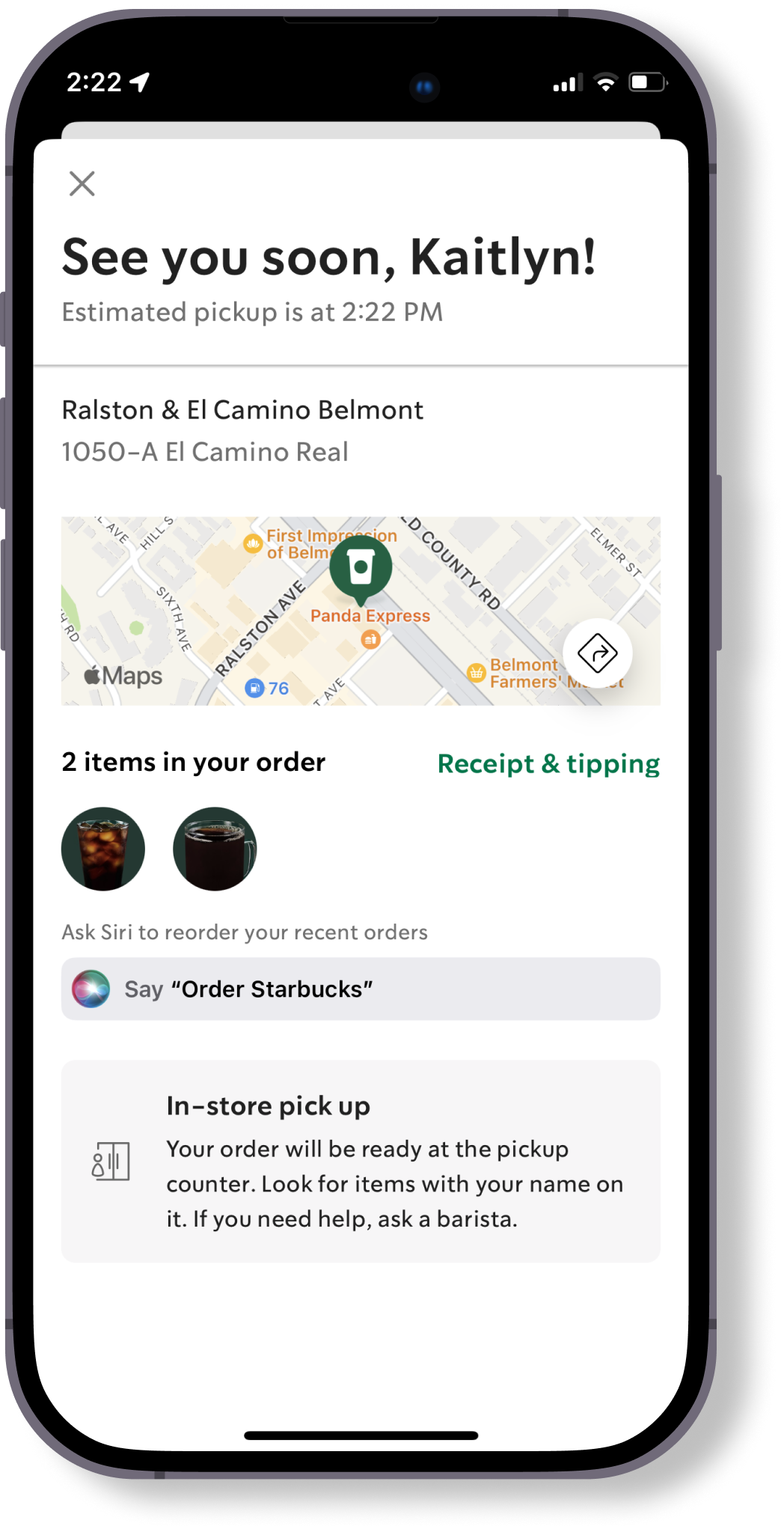


From discussions with my mentor we decided upon three different stages of the ordering process which is shown below.


With a functional prototype in hand, my objective was to validate the design's intuitiveness and its ability to instill user confidence in the mobile order pickup process.
Our goal is to gather data that quantifies users emotions waiting for their Starbuck's order.
Click here for usability test planI asked users to rate their confidence in picking up their mobile order, using a scale of 1 to 7. I obtained ratings for both the original checkout process and the new progress bar feature.
Starbucks App users who utilize the mobile ordering feature at least once a week.


Adding a simple feature like a cheers confirmation can have a significant impact on the user experience. It shows that even small touches can make a big difference in how users perceive and interact Starbucks. Through my usability testing I was able to quantify that user's on average felt 40% more confident when picking up their Starbuck's mobile order.
If time permitted, I would have liked to explore more micro interactions to make the progress bar more delightful.